I was thinking about originally making this a Facebook post but decided to write it here instead.
I know I have been wildly inconsistent with the strip and there are several reasons why. So, I thought I’d write this post to let everyone know what’s been going on and why I have been so wildly inconsistent.
My big studio move
Earlier this summer, my wife and I decided that my son and I would switch rooms. We’re lucky that our house has four bedrooms. My wife and I have the biggest room, my daughter has the second biggest, my son had the third and my studio was in the last. smallest bedroom. Over the years, I had woefully outgrown the space and my son no longer needed the extra space, so my wife and I embarked on a plan whereby my son and I would change rooms.
That was a massive overhaul that took way longer than expected. And some home improvement work that needed to be done as well. One of the electrical outlets in my son’s room needed to be repaired before I could even think of moving all of my computer equipment in there – plus, we had to test and make sure I could get a consistent internet from the room itself. All of this work took an incredible amount of time but has been well worth it. But that meant a stoppage in being able to produce the strips while all of this was going on.
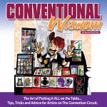
Convention Season was in full bloom
During the same time as the “studio/bedroom move”, multiple conventions all happened at the same time… Greater Philly Con, Free Comic Book day, Tidewater Comic Con, Awesome Con, Dan Nokes‘ own personal show plus a few others. The nice thing about being on the comic book convention circuit for the last eight years is that I have built up a nice little commission art business. After every show, I usually have a few commissions I have to crank out. And that is a great, humbling thing to have… people liking what you do so much, they are wiling to give you money to wait for you to finish their commissions and send the final product to them.
But… there is only so much time in a day or week where you can actually draw. For me, the strip is something I do for free for all of you and, if someone is willing to give me money for a commission, their commission is the bigger priority and should be completed before a strip is created. Needless to say, with all of these conventions so close together, I suddenly had a backlog of commissions and art I had to produce. So, that meant the strip had to be put on a backlog for a while.
Every time I thought I was just about caught up with everything and could start working on a few more strips, another show would pop up and I’d be in the same situation all over again.
I discovered I missed playing baseball
Many of you know that for many years I played in a men’s recreational baseball league. I stopped playing for the last few years (three) because after years of catching for really crappy teams, my body started breaking down with various nagging (but not serious) injuries where it made it just wasn’t a whole lot of fun to play any more. But last year, I was asked to help out a local team and I quickly realized how much I missed playing. BUT because I hadn’t played in a number of years, I got into a lot of bad habits that resulted in my gaining a lot of weight.
The good news is that last year, I actually lost some weight but for a variety of reasons, when the season ended and the fall & winter approached, I gained all that weight back plus more. In fact, I gained so much weight, I wasn’t sure if I wanted to play any baseball again this year. Eventually though, I changed my mind and decided I would play again. But because I waited so long to make that decision, it would mean I’d essentially have to play baseball TO get in shape instead of having enough time to GET into shape in ORDER to play baseball. Again, all while convention season was in full bloom as well.
I’ve made a couple of ‘lifestyle” changes
Back in late June, I developed a nasty case of gout in my right big toe and foot. Never knew anything about gout before but trust me, it’s not something you want to experience – at least not what I had anyway. I ended up doing a lot of reading about gout and had made a few significant changes in my diet. The BIGGEST (and hardest) change for me was killing sodas from my diet. Since the middle of July, I have not had a single soda. For the people that know me, you all know this has been comparable to a chain smoker suddenly going cold turkey. That has been the biggest “lifestyle change” I have recently made but I have so much more to do. I have also started taking a regular dose of vitamins, fish oil and potassium to combat the gout but it also has given me a lot more energy too. I also increased my exercise routine as well. Apparently though, I have increased my exercise too much though as I am currently in the process of dealing with a mild to severe left quad strain coupled with tendinitis in that same left knee. NOT fun!
The combination of all of these little changes has meant I have gone from 314 pounds in late March to currently being in the 288-290 pounds range. I still have a long way to go to get to my eventual goal of 250 pounds though. And I realize 250 pounds still a lot of weight for my frame but 250 pounds would be the lowest I have weighed since I last coached high school baseball a few years back.
I’ve had a couple of freelance gigs come my way
Did I mention I have a tendency to over extend myself? Well, in addition to all the conventions I have gone to, all the commissions I have received, all the baseball I have been playing as well as all the added exercising I have been trying to do, I’ve also been fortunate to have had a few freelance gigs come my way as well. One of those freelance gigs I am currently working on right now but it has meant trying to learn parts of Adobe Illustrator that I’m not familiar with and requires a lot of practice.
I’ve also written myself into a corner as well
Thanks to a lot of people’s suggestions on Facebook, I was able to show a lot of crazy, preposterous ways Roy got silver poisoning. Unfortunately, as as typical with me when it comes to long story arcs with Capes & Babes, I have a great idea and just sprint out of the block with it without giving any thought to how such a great idea might end. That’s currently what I’m dealing with right now… where do I logically go from here? I’m not sure. Some of it it writer’s block and some of it is not coming up with an idea that is personally satisfactory to me.
As Crash Davis from Bull Durham might say, “I’m dealing with a lot of stuff right now…”.
But there is still so much more I want to do
Thanks to the last Webcomic Alliance podcast, I have a bunch of ideas I’d like to do. In terms of the strip:
- I am very excited about creating a “Best of Capes & Babes” book and have it out before Christmas this year!
- I REALLY do want to get back to consistently producing the strip
- I need to come up with a very regimented schedule for me in terms of strip creation, exercise time and completing any commission and freelance work
If anyone has any suggestions on that last topic, I am very interested in hearing what works for them. I am tired of just trying to “shoot from the hip” when it comes to everything I want to do, everything I have to do and everything I need to do. Although I tend to live a very improv type of life, I find I am much more successful (and consistent) when I stick to and maintain a very regimented schedule.
So, what kind of schedule works for you?